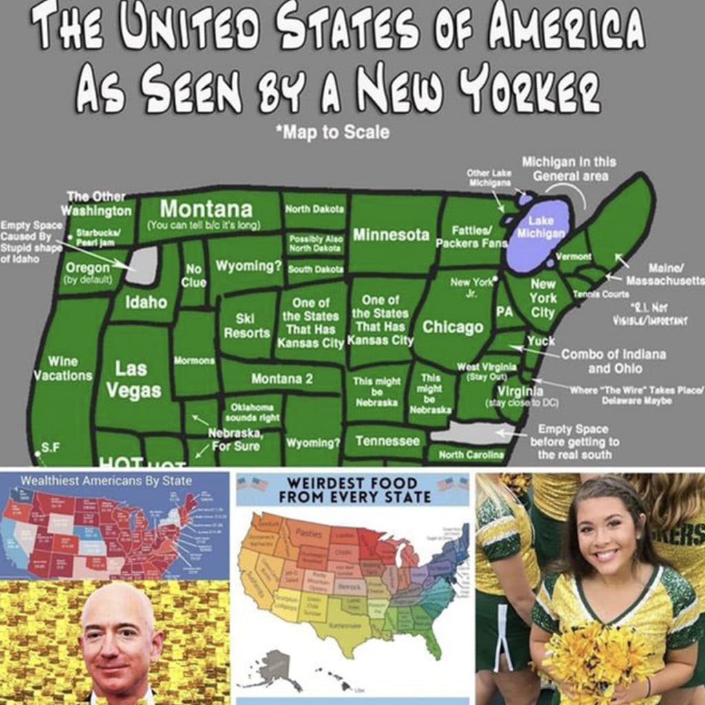
Things on maps sometimes appear bigger to us than they truly are, similar to how they appear in a side-view mirror. Consider this: a globe map depicts Greenland as a massive landmass the size of South America, despite the fact that it is actually rather little in comparison.

Then there’s the Mongolian Empire, which encompasses more than nine million square miles. But how does that region seem on a map in relation to the rest of the world? Don’t worry; these maps will help you see things in a new manner and may even give you a more global perspective.
