
#16: Brand Growth or Bout of Depression?
You may have noticed that modern architecture is pretty monochromatic and uniform these days. Everywhere you go, you’re bound to see some gray, geometric-looking building that looks like 50 other buildings you’ve seen before. Well, McDonald’s has jumped on that bandwagon and abandoned the bright red-and-yellow color scheme from Gen X’s youth.
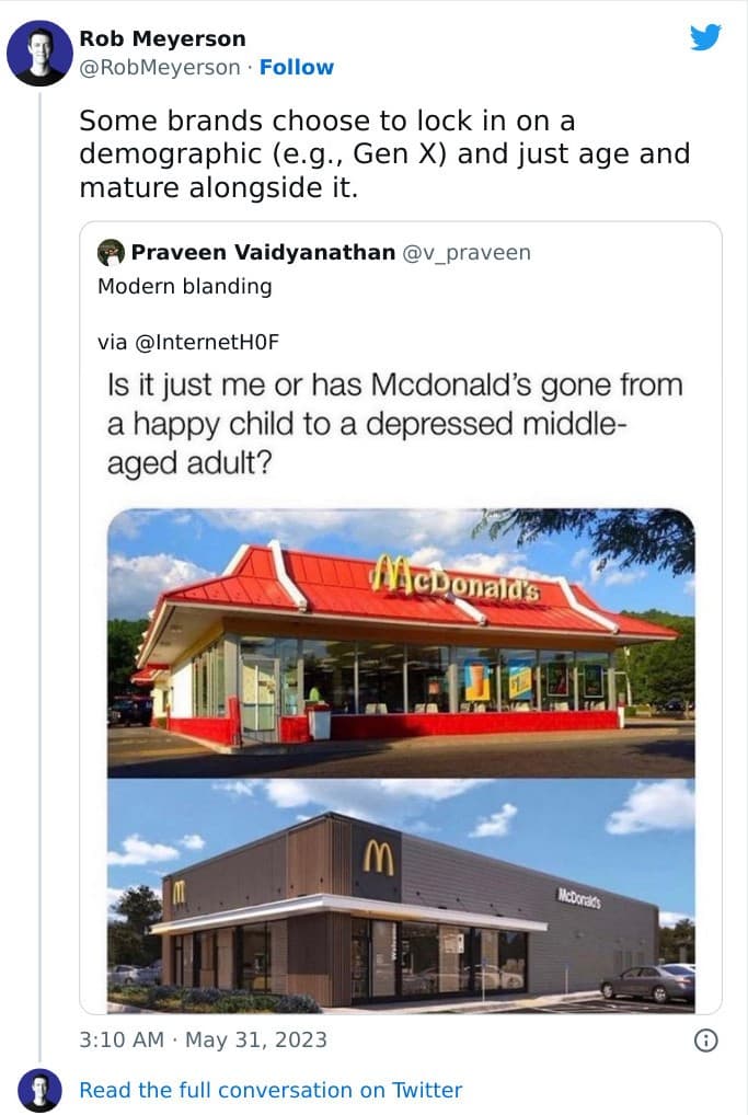
The new McDonald’s restaurants definitely look more “grown-up” than they used to, but they also look more boring. No Gen Xer with any self-respect wants to be reminded that they, too, are grown-up and boring! Let’s bring back the garish, bright color scheme from decades past. If it ain’t broke, don’t fix it.
Pages: Page 1 Page 2 Page 3 Page 4 Page 5 Page 6 Page 7 Page 8 Page 9 Page 10 Page 11 Page 12 Page 13 Page 14 Page 15 Page 16 Page 17 Page 18 Page 19 Page 20 Page 21 Page 22 Page 23 Page 24 Page 25 Page 26 Page 27 Page 28 Page 29 Page 30 Page 31 Page 32 Page 33 Page 34 Page 35 Page 36 Page 37 Page 38 Page 39 Page 40 Page 41 Page 42 Page 43 Page 44 Page 45 Page 46 Page 47 Page 48 Page 49 Page 50 Page 51 Page 52 Page 53 Page 54